

Did you know that people process visual information 60,000 times faster than text? That stat blew my mind the first time I read it—and as a research strategist at RI Digital Research, it confirmed something we see daily: the way you present your data is just as important as the data itself. In a world overloaded with information, clean, effective data visualization in research helps our insights cut through the noise. Whether we’re presenting trends from a multi-market study or highlighting customer sentiment in a B2B tech landscape, strong visuals aren’t just “nice to have.” They’re essential.
Let me walk you through the real techniques we use to turn dense research into stories that get remembered.
Why Visuals Make or Break Your Research Story
No matter how robust your methodology or how fascinating your findings, if your audience can’t grasp it quickly, you’ll lose them. That’s especially true in stakeholder presentations, where attention spans are short and decision-making timelines even shorter.At RI Digital Research, we often see clients react more strongly to a well-designed chart than to a slide packed with bullet points. Why? Because good data visualization bridges the gap between insight and action.
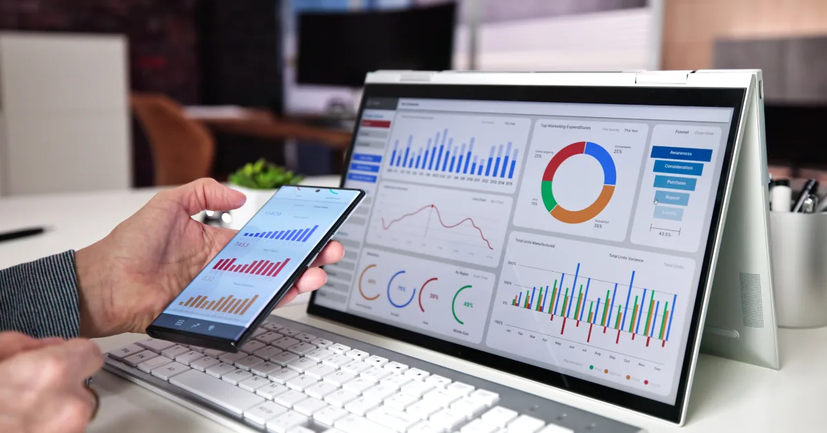
Real Example: Executive Dashboards That Drive Action
When we delivered a brand health tracker to a fintech client, we ditched traditional slide decks in favor of an interactive Tableau dashboard. Suddenly, VPs could filter results by region, see trends at a glance, and drill down into what mattered most. Engagement jumped. So did buy-in.
Best Practices We Swear By
Over the years, we’ve refined a few core principles that make our data visualizations consistently high-impact. Here are a few:
1. Choose the Right Chart for the Job
Pie charts aren’t dead—but they have a time and place. For showing proportions, we lean on donut charts. For timelines, line charts still rule. And when comparing categories? Bar charts are our go-to. The key is matching chart type to the message, not the other way around.
2. Don’t Overwhelm with Color
Color should guide attention, not distract. We use no more than 3–4 colors per graphic and lean into brand palettes to maintain consistency. Tools like Datawrapper and Flourish make it easy to customize color themes.
3. Focus on One Key Insight Per Visual
We often ask: what’s the one takeaway we want from this chart? Then we design around that. Too many labels, trend lines, or axes? It clouds the story.
4. Label Clearly and Cut the Jargon
You’d be amazed how many dashboards are filled with acronyms only the research team understands. We always translate findings into plain language. Even something as simple as changing “Net Promoter Score” to “Likelihood to Recommend” helps accessibility.
Tools We Actually Use (and Recommend)
We don’t believe in reinventing the wheel. These are the tools that help us create clean, responsive, and interactive visuals:
- Tableau: Great for dashboards and stakeholder reporting.
- Datawrapper: Ideal for media-ready, embeddable charts.
- Flourish: Excellent for animations and storytelling formats.
- Power BI: A must for enterprise clients who want Excel integration.
We sometimes use Google Data Studio for quick-turn client demos, especially when they need real-time data access.
Turning Data Into Dialogue
Here’s the real secret: data visualization isn’t about making things pretty—it’s about making them meaningful. Our most successful client engagements happen when the visuals prompt discussion, not just understanding.
If you’re struggling to get stakeholders to engage with your research, ask yourself: are you showing the story or just telling it?
At RI Digital Research, we build every visual with that goal in mind.